 Texturing Guide
Materials must be in PNG format and include 6 files: Diffuse/Albedo, Emissive, Normal, Roughness, Specular/Metalness, and Tintmask. Our naming convention for these files is:
- Body_d
- Body_e
- Body_n
- Body_r
- Body_s
- Body_t
Where Body_ is replaced by Helmet_ Weapon_ Syandana_ Liset_ for the appropriate content type. Please don’t add custom names here.
Other things of note:
- Scrolling Emissives: for pieces intended to have a scrolling emissive effect, you’ll want to add that to the alpha channel of your emissive texture.
- Tint Masks: tint masks are made up of four black and white masks packed into the RGB colour channels and one alpha channel of the TintMask texture.
Important Note: In Photoshop, to open and save PNG files with their alpha channel intact, you must install the following SuperPNG plug-in. It will provide several options including discarding or retaining alpha channel information, which is essential in our case. Hold SHIFT while dragging a PNG into Photoshop to get the dialog option to have the alpha come in a separate channel.
General Texturing Notes:
Warframe is a Physically Based Rendering (PBR) game. If you already have texturing experience this is an excellent tutorial on how to approach PBR materials. If you are new to texturing this is a constantly expanding resource to help you learn that skill.
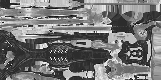
We do have to craft our textures a little bit differently to allow for maximum customization. The Albedo/Diffuse cannot have a strong tone and hue component baked in (examples below). We also pack our maps into single channels to reduce download size and draw calls, which means they will not retain color in the individual maps. All this results in maps that look different from what you would expect when you first load them, but there is reason behind it.
With our changes to texture compression, we recommend taking additional steps to ensure your piece looks the best it can in-game. There are multiple ways to approach this, but below are a few examples to avoid common issues we see:
- Test all of your textures at in-game resolution, and make sure you test them together at this resolution. You can see final resolution numbers in the Final Submission Checklist available here or in the file download.
- Optimize your UVs to get the most out of your limited resolution. Good UV mapping practices go a long way in helping your piece look its best, so check out online resources on how to improve this important skill.
- Avoid adding micro-details to your normal maps. These can get incredibly busy and messy once they are added in-game. If you want to add micro-details to your piece, you can request that we use our own internal atlas detail in your submission’s readme document.
GENERAL MAP OVERVIEW
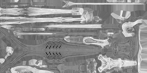
Diffuse/Albedo (Filename_d)
The creation method is very similar to a traditional diffuse map, but we require the map to fall in two main luma ranges for customization:
- Non-Metals roughly 50% luminance or 128 on a 255 point scale.
- Metals roughly 80% luminance or 186 on a 255 point scale.
Counterintuitively, this map isn't that important. Most of the work it used to do is in the TintMask. Some luminance variance is welcome but should be avoided to ensure proper tinting of your item. If you want an area to be untintable you can paint it anywhere in the luma range you wish, but note that it will be in grayscale once added to the game -- we recommend avoiding untintable areas where possible, since it limits the player's customization options.
Normal (Filename_n)
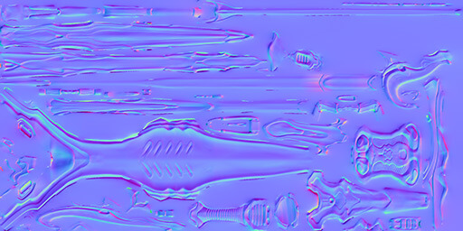
This usually is the most critical map: it’s not a painting, it's a collection of math that tells the shader how to interpret the X Y Z of the surface normal. If you're sampling colours and painting a normal map, then something is going wrong.
Good sources for normal maps:
- nDo, Substance Painter, Designer based height maps
Bakes:
- A normal should be in 16bit. The final in-game format will still be very compressed, but Microsoft's compressor does much much better with a HQ 16bit info than an 8bit bake.
- Designer and Painter bake 16bit by default, you do have to setup xNormal to work that way (plugin tab, set your format to .tif and make sure that is set to 16bit).
Some of our older assets were built before we were aware of this, but we do try to keep all new assets done this way.
Metalness/Specular (Filename_s)
When working with PBR materials, it's a good idea to research and understand the two different workflows: Specular and Metalness.
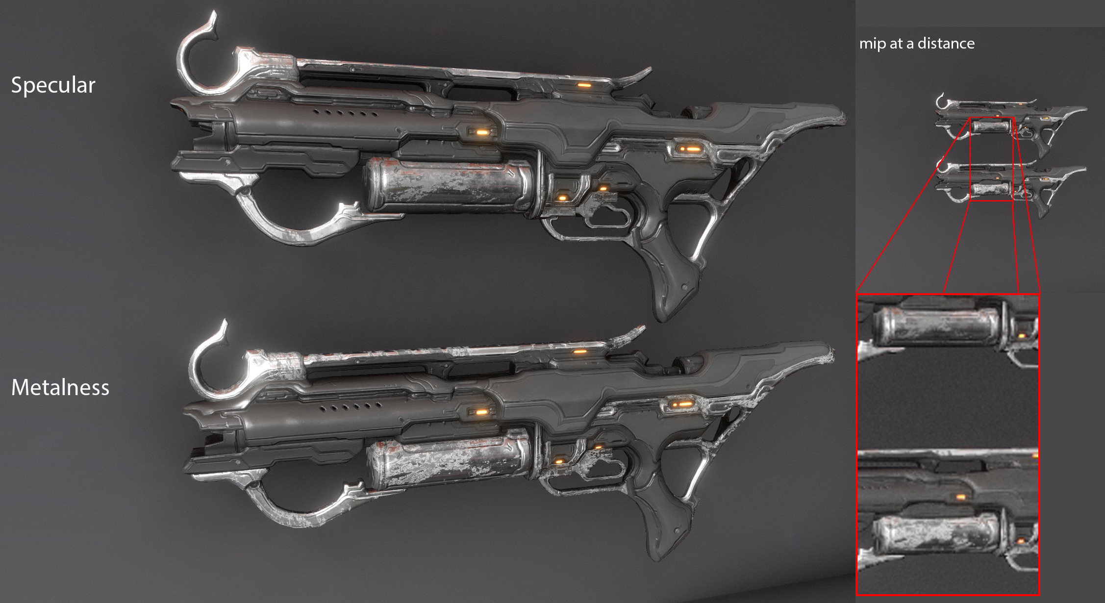
For Metalness: it's important to make sure your "specular" (or "metalness") texture makes use of solid black and white, as this map is ONLY for dividing metal from nonmetal on your final material.
In the situation where you are creating very small chipping details, or very heavy, speckled grime, we suggest you switch to the Specular workflow, as Metalness has been documented to create heavy aliasing along the edges of all these small details. This is amplified even more once the piece is in the game. Specular workflow will not create this type of artifact with tiny metallic edges/tiny grimey details on metal.
If working in the metalness PBR workflow:
- This map separates metal and non-metal areas.
- Rule of thumb: If something is metal, make it white and everything else black.
If working in the specular PBR workflow:
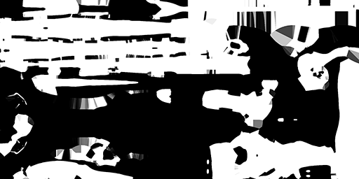
- Similar to metalness, metallic areas on a specular map should be very light in value compared to the nonmetal areas, but these metallic areas should retain some detail. Everything else will be much darker.
*It’s often helpful to us if you specify in a ReadMe file which PBR workflow you are using (metalness or specular), as the files sometimes appear similar. Make sure not to mix workflows, choose one or the other.
Roughness (Filename_r)
This controls how rough or smooth a surface will feel and conveys the history, character, and backstory of a material. This map requires the most artistic judgement!
Material differentiation between tints is very important to make your creations feel dynamic, whether the player is whirling through missions, or taking close-up Captura shots. Look at how each faction approaches their materials using our Faction Style Guide and see what kind of story you can create for your piece using your roughness map.
Adding edge wear, putting grime build-up on contact points, reinforcing material changes (IE: the roughness difference between rust and metal), and most importantly; not doing any of those things if the piece isn't supposed to be telling that story.
Here’s some general roughness values for reference:
- A super shiny metal is a 0.2 roughness value and shiny plastic is 0.4 or 0.5. This is important to keep in mind to prevent your metals from looking like plastic!
- 0-0.15 (pure or nearly pure black) rarely are used.
- Anything approaching 1.0 (full matte) ends up responding to lighting very poorly, and does not tint well. It will look like chalk or a pencil eraser.
Emissive (Filename_e)
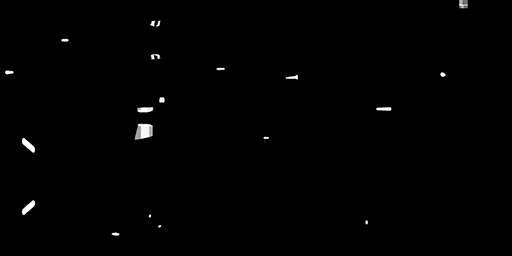
This black and white map will control what areas glow in your material! This effect should be used very sparingly, as emissives are meant to highlight focal points!
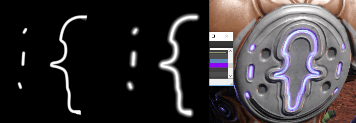
It is important to feather/blur the edges of the emissive lights to allow for softer gradients. Doing this will also give secondary emissive colors extra space to blend. This way the appearance will be more natural and soft.
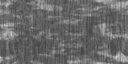
If appropriate, you can pack a mask for the emissive in the alpha channel. This will be panned over top of the existing emissive, giving the glow the appearance of fading on and off.
Tintmask (Filename_t)
This map is how you apply colour to the piece: it’s incredibly important for player agency and customization. You have a tremendous amount of control on how the piece will look, so as a result this map requires the second most artistic judgement.
Unfortunately it's very technical to work with, which is one of the reasons that we are publishing our Substance Painter shader as that does make it much more intuitive. It's a layer cake and the order of layers cannot be changed:
- Red is the bottom layer, and is often bucket-filled to fill the entire texture.
- Green is screened on top of Red.
- Blue is screened above Green.
- Alpha is in the alpha channel and will run over top of everything. If you want to add areas that cannot be tinted, you can add a layer with black areas that will instead show the base diffuse (which will be colorless).
How the RGB channels appear, with the alpha viewed separately:
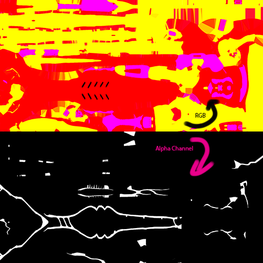
- Tint0 is Red
- Tint1 is Green applied as a screen layer
- Tint2 is Blue applied as a screen layer
- Tint3 is an alpha channel
The reason we use a system of layering vs. a flattened map with solid colors is because the mask separation will never be perfect in-engine due to engine interpretation, and will produce ugly halos around certain tint colors when not layered properly.
To avoid this, simply make sure to expand the mask areas under the edges of each tint that is layered above it. For example, Red channel will run under all layers if it is bucket-filled in, but the layer above (Green channel) will need to have its edges expanded underneath the Blue channel, otherwise, the Red channel will peek through along the edge where the Blue and Green channels meet. Alpha sits above everything else.
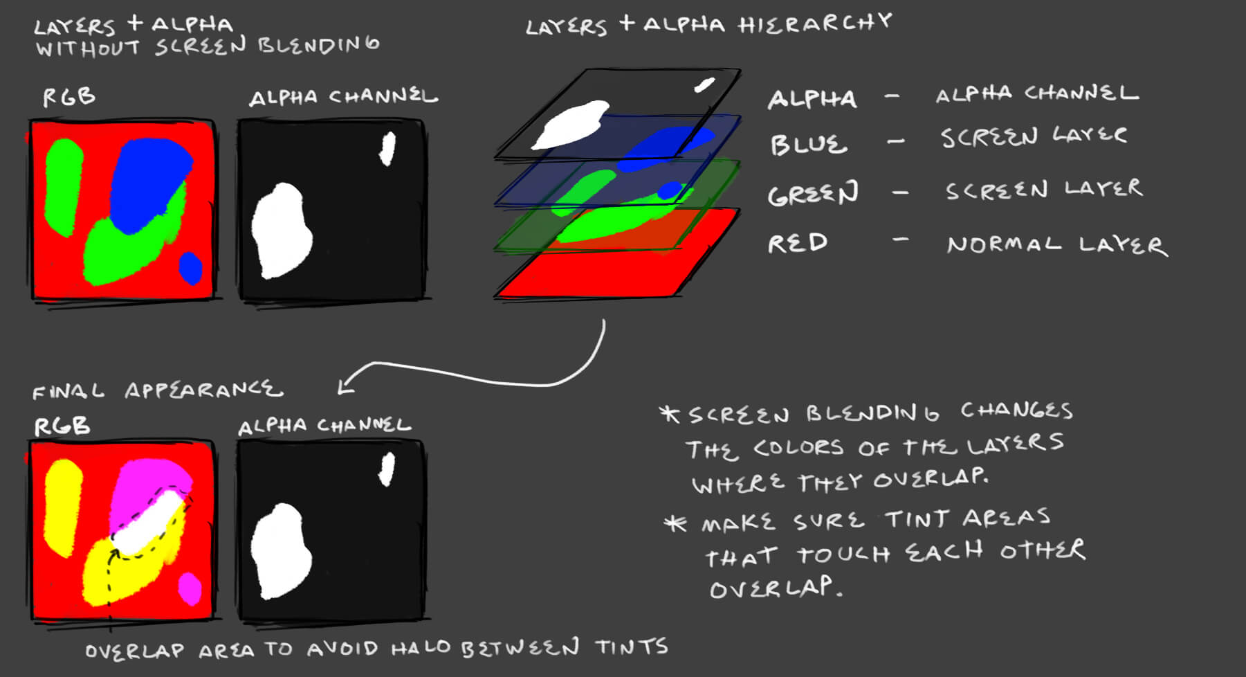
Experiment with this a bit to get a sense of control. Please make sure to make use of all 4 of the channels, as players appreciate this for matching to other items.
Texture Creation Tools
Painting / Image editing:
Paid: https://www.allegorithmic.com/products/substance-painter
- Our painting tool of choice. Please see our specific guide section here
Free: http://krita.org/
- Very cool painting program that is making great strides as a texture painting application.
Free: http://www.gimp.org/
- The classic free paint / photo manipulation program.
Paid: http://www.photoshop.com/
3D Programs
Free: http://www.blender.org/
- Long standing free 3D program. It would work well as a texture previewer and has 3D painting capabilities.
Paid: http://www.marmoset.co/
- Excellent 3D previewing application
Free: https://sketchfab.com/
- Great 3D previewing website that doubles as a great previewing tool for the DE team when reviewing your work. You can even embed it into your workshop submission!
Paid: http://3d-coat.com/
- Another solid 3d Painting program